adjust responsive option in wpbakery page builder plugin WP Bakery Page Builder
• In some cases, `Enter custom layout for your row` is not sufficient to make responsive in mobile. For example, we have four `Info Box` align with ratio 1/4.
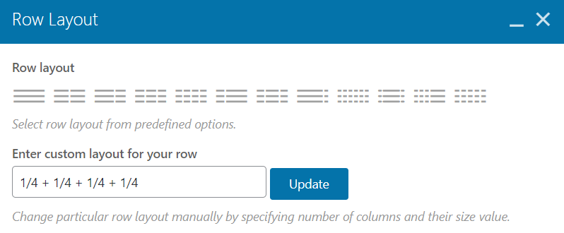
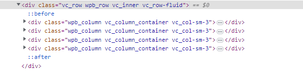
• Our next step is to inspect the element in the browser.
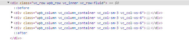
• Now, let assume that we need row with two columns to rearrange order of all of `Info Box`. Open `Inner Column` which contains `Info Box` and navigate to `Responsive Options`.

As shown here, a ratio of 1/2 indicates that there are two columns in a single row in mobile responsive mode.
24
number representing growth wp bakery builder use WP Bakery Builder to create Contact Us footer layout icon and text in Text Block using wpbakery plugin advanced carousel in wpbakery page builder text image box in WP Bakery Page Builder add image from Figma to WP Bakery Page Builder align widget center in WP Bakery