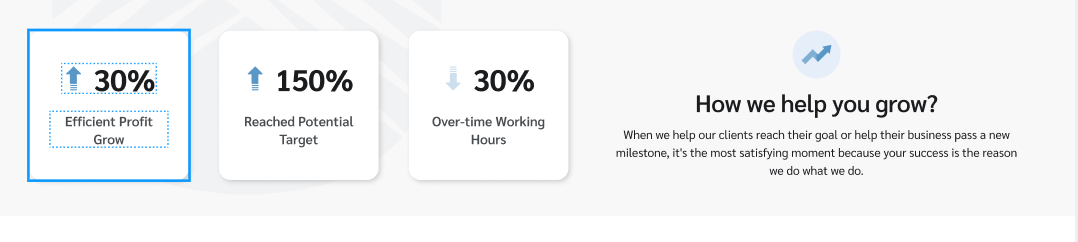
• Be assumption that you need WordPress page represent product or software that user can visit and be impressive. This is design as part of page that shows numbers and how software/product grown up your business.
• When it comes to the design, we will consider which widget suitable for implementation. Let make Section » Row (divide column with ratio 1/2+1/2) and nested Inner Row with ratio (1/3 + 1/3 + 1/3).
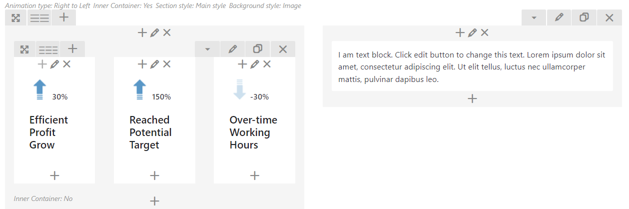
Note: You need to setup `background-image` and `min-height` in `Inner Row` element. To imagine what UI looks, take advantage Text Block to edit and view in browser.
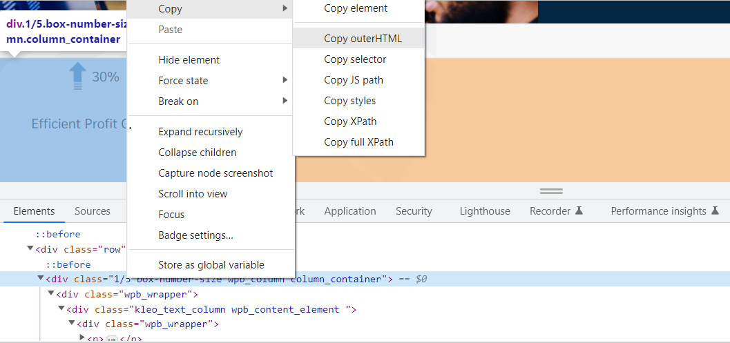
Note: You can use `Copy outerHTML` to get sample HTML.
• Replace `Text Block` by using `RawHTML` and the result shown as the same. Hence, carry out of custom HTML to make sure User Interface fit requirement.
In other hand, if you want to take advantage `Text Block`, we can write custom CSS as below to get the same UI.
.box-number-size > .vc_column-inner > .wpb_wrapper {
    background: white;
    box-shadow: 0px 4px 10px 0px rgb(0 0 0 / 10%);
    border-radius: 28px;
}
.box-number-size > .vc_column-inner > .wpb_wrapper > .kleo_text_column > .wpb_wrapper {
    text-align: center;
}
.box-number-size > .vc_column-inner > .wpb_wrapper > .kleo_text_column > .wpb_wrapper > p {
    padding-top: 44px;
}


.box-number-size > .vc_column-inner > .wpb_wrapper > .kleo_text_column > .wpb_wrapper > p > strong {
    font-size: 40px;
    box-sizing: border-box;
    vertical-align: text-bottom;
    font-family: inherit;
}


.box-number-size > .vc_column-inner > .wpb_wrapper > .kleo_text_column > .wpb_wrapper > h3 {
    font-weight: 600;
    font-size: 18px;
    color: #484C4F !important;
    font-family: inherit;
    line-height: 24px;
    margin-top: 4px;
    padding-bottom: 24px;
}
Note: Insert extra class named `box-number-size` in Column Settings element which contains `Text Block` element. If place `Text Block` element outside of `Inner Row` and you can remove `.vc_column-inner` and custom CSS.
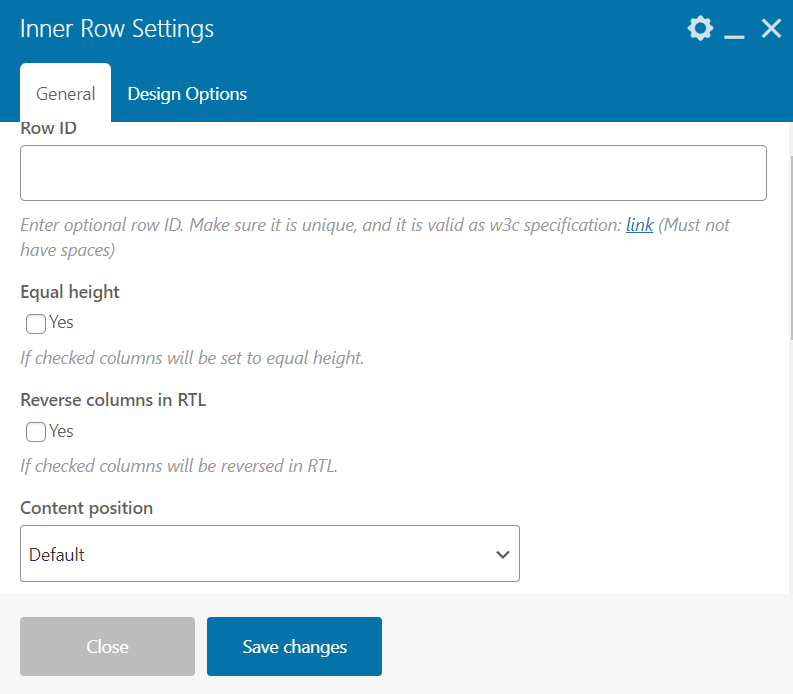
To have established column gap between columns, you can column gap in Inner `Inner Row` or `Row` element.
In the other hand, you can use wrap content and style in `.wpb_wrapper`.
• For mobile responsive, you can duplicate element and focus on customize CSS for mobile resolution only.
.mobile-resolution {
    display: none;
}
.desktop-resolution {
    display: block;
}


@media only screen and (max-width: 600px) {
    .mobile-resolution {
        display: block;
    }
    .desktop-resolution {
        display: none;
    }
    // Your Custom CSS
}